A refreshed identity inspired by the spirit of those living with Parkinson’s
Parkinson’s UK
Project
Brand Identity
Date
April 2019
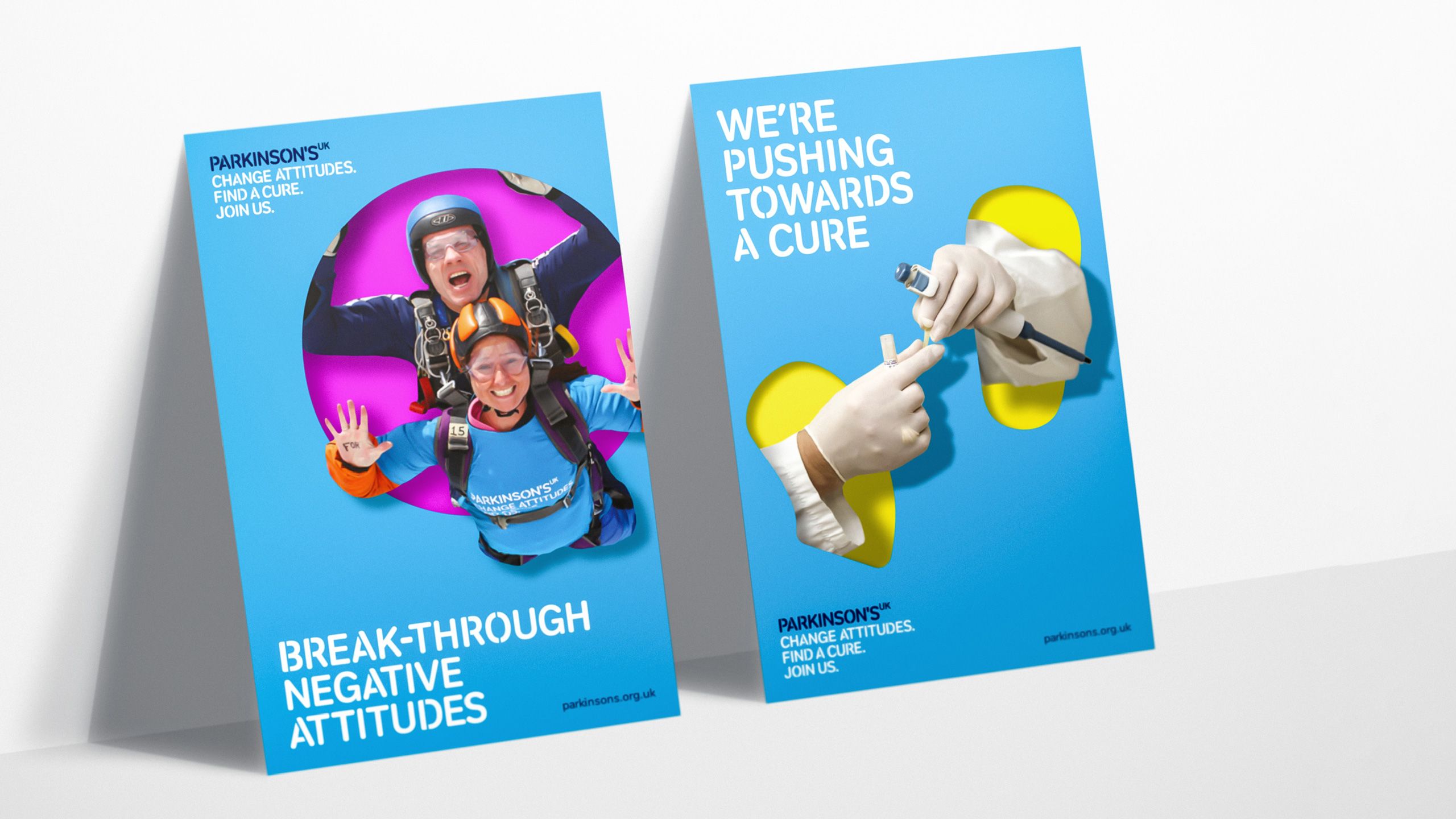
Parkinson’s UK needed to take a decade old brand identity that was increasingly losing its creative spirit, and inject it with new personality and positive energy. They didn’t want to lose the existing assets that their community recognised: a stencil font, cyan colour and existing logo and strapline. But, it wanted to gain stand out in an increasingly crowded charity market, and function in the digital space.
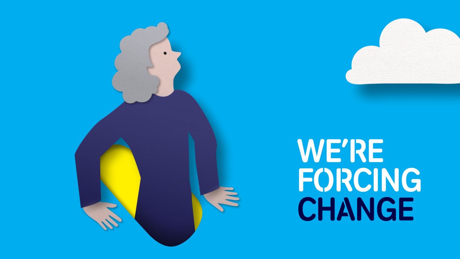
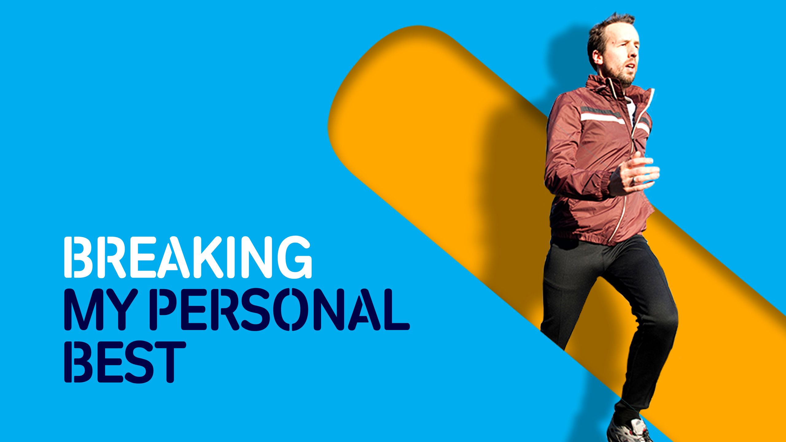
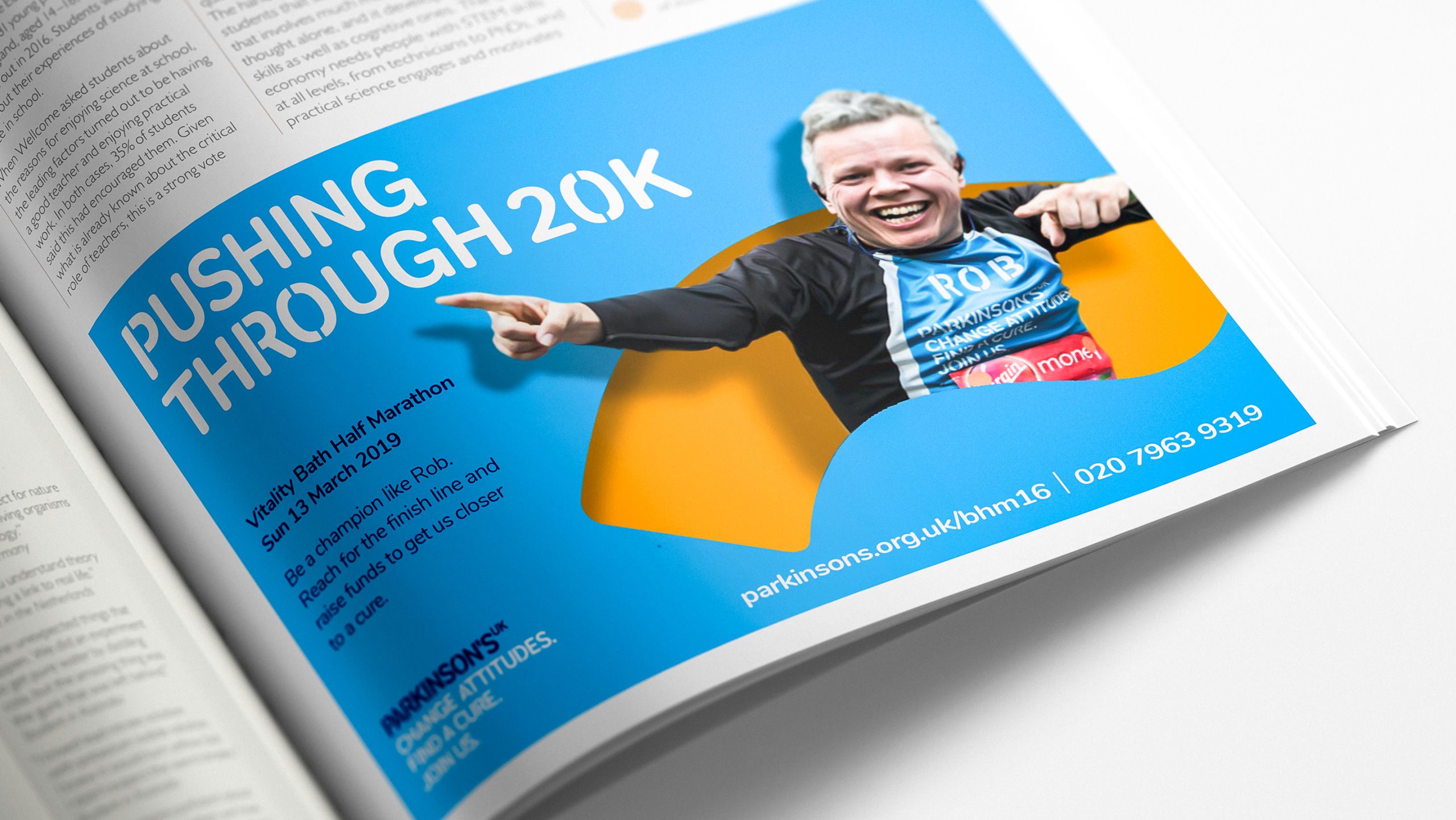
Our core idea: ‘Breakthrough Force’, demonstrates the gutsy and tenacious spirit of people living with Parkinson’s, who get on with their life against unimaginable barriers. By taking the stencil font; breaking it up and cropping in, the resulting shapes were used to show people breaking out of them.
Texture are a hidden gem. My brand challenge wasn’t easy, with difficult timeframes and high ambitions. But Texture brought brilliant ideas, clear rationale, and always kept us on track.
Hannah Dedman
Head of Brand, Marketing and Content, Parkinson's UK
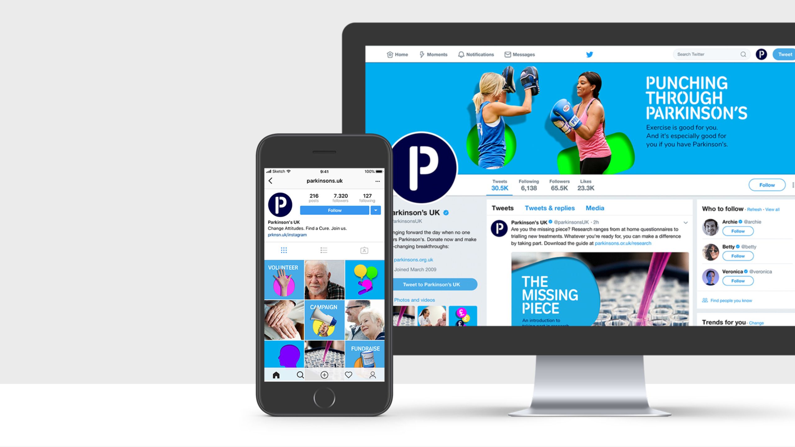
New brighter secondary colours were introduced to make the most of the digital space, and more impassioned and positive language introduced in messaging. Previous angled type treatment was simplified, to allow imagery and messaging to dominate. A simple avatar allowed a bolder social media presence, and navy replaced black in their logos to create a sophisticated design aesthetic.
The biggest challenge was the knowledge that the internal design team wouldn’t have big budgets for designing and implementing this identity. We needed an image approach that considered projects with no budget or quick turnaround requirements, as well as projects that had opportunity to be more creative. To solve this problem, we created three graphic styles ranging from a simple set up to a more ambitious hero execution. These would make the most of imagery available, with enough structure to stay recognisably in line with the new identity.
It’s the ultimate challenge for the charity sector and design industry – keeping design expectations high, building brands that stand out and inspire, while remaining realistic about the demands of a complex charity.
More projects.
Maximising the value of incredible content
Helping liberate the lives of veterans living with PTSD
A campaign to spark action