Bringing a sector together
Homecare Association
Project
Brand strategy + identity
Date
June 2022
The Homecare Association (or UKHCA as they were then known) approached us to conduct a root and branch rebrand exercise.
They knew their brand wasn’t expressing them in a way that captured a forward-looking attitude, and respect they held as a membership organisation for their sector. It was doing the exact opposite.
The brief asked us to consider a name change, brand strategy, visual identity, and tone of voice. Through an exploration process we discovered an organisation within a complex, highly regulated sector, that is invaluable but often overlooked in today’s society. Home carers allow people, in need of support, to gain that within their own environment, and as a consequence, retain a level of independence in their life. And as was particularly highlighted during the pandemic, the Homecare Association is a organisation representing and standing up for its sector – providing the tools as well as the influence, the sector needs to do its work.
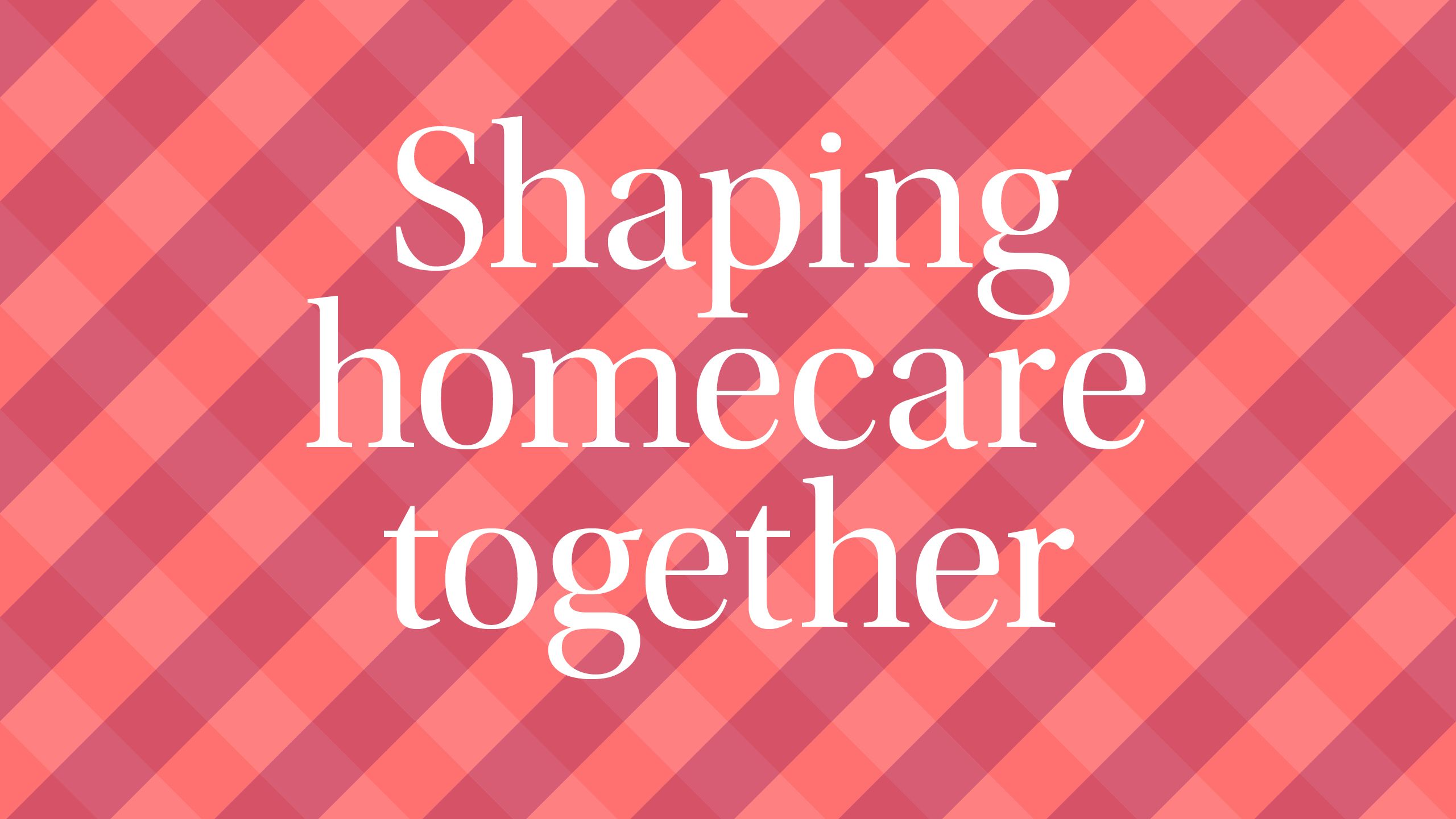
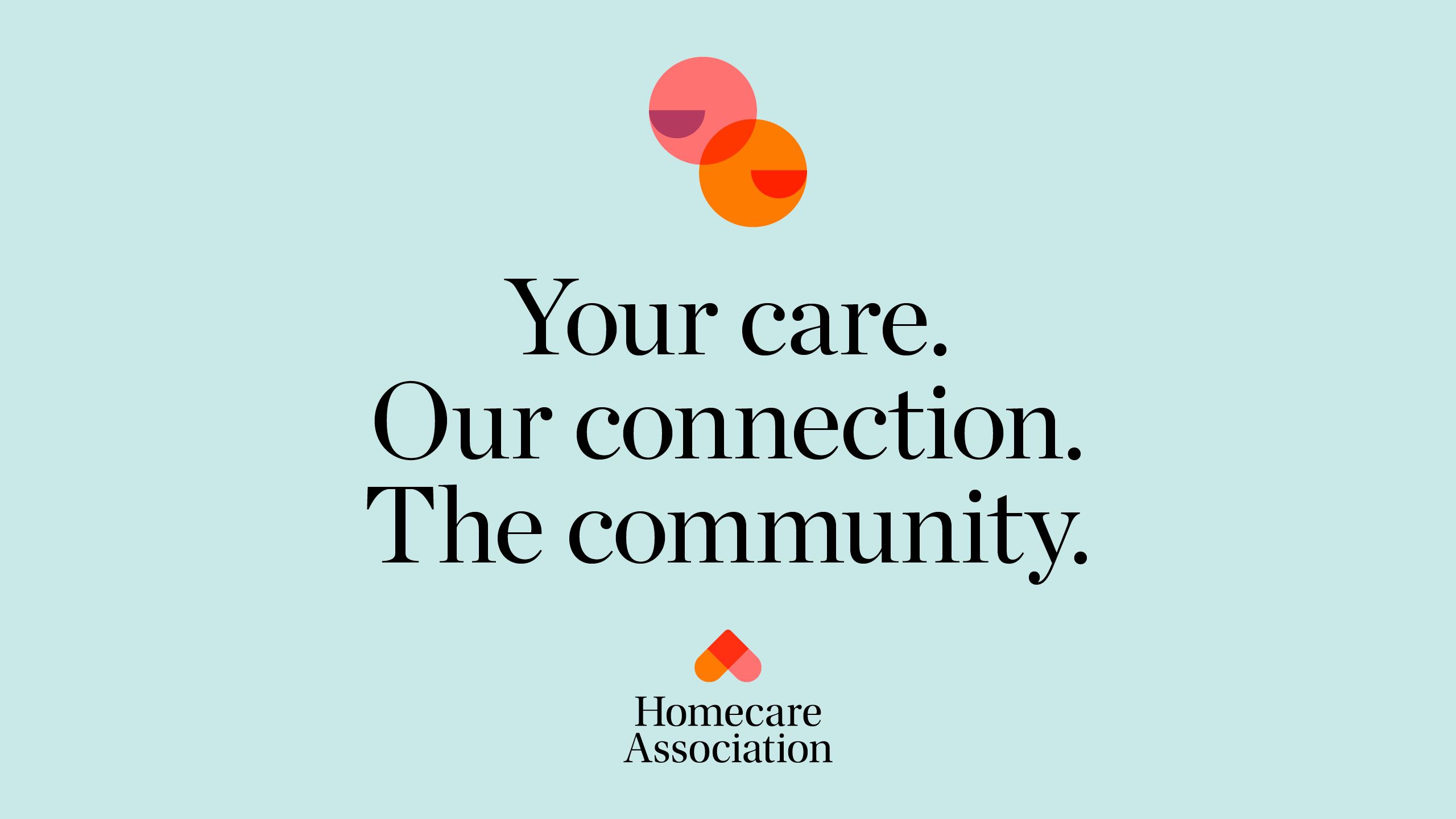
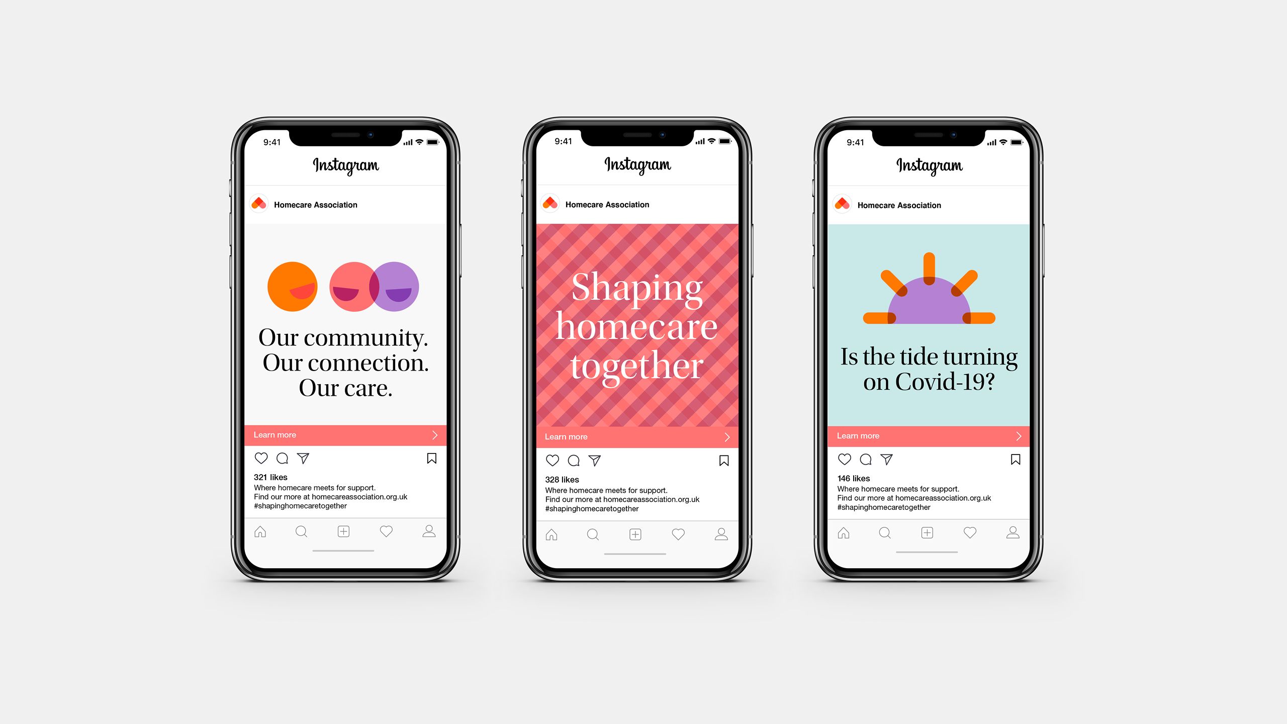
We encapsulated this interdependence between organisation and sector, through a brand idea: ‘Shaping Homecare Together’.
This simple articulation underpinned the whole direction of the identity, starting with the logo. As a place where passion meets compassion, the heart was a great place to start. But that alone was too one-dimensional. It had no wit. Nothing memorable about it. The simple flip changes that. And, as they say, home is where the heart is.
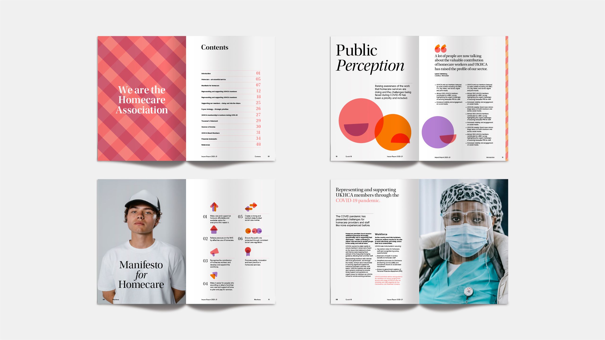
The treatment of the logo suggests a point of intersection, which then unlocks the homely expression of the gingham and a complimentary icon suite. With all those rounded edges, the tone of voice and messaging create contrast by being sharp and to the point.

Homecare Association now have an identity which represents their role within the sector, puts members at the heart and does with clarity and distinction.