Bold thinking for better health
The King’s Fund
Project
Brand identity
Date
March 2026
The King’s Fund has a long history and rich heritage, created in a time of old power, where money, influence and knowledge was held by the most privileged in society. Today things are different. New power is more distributed. Better thinking comes from diversity of views and perspectives.
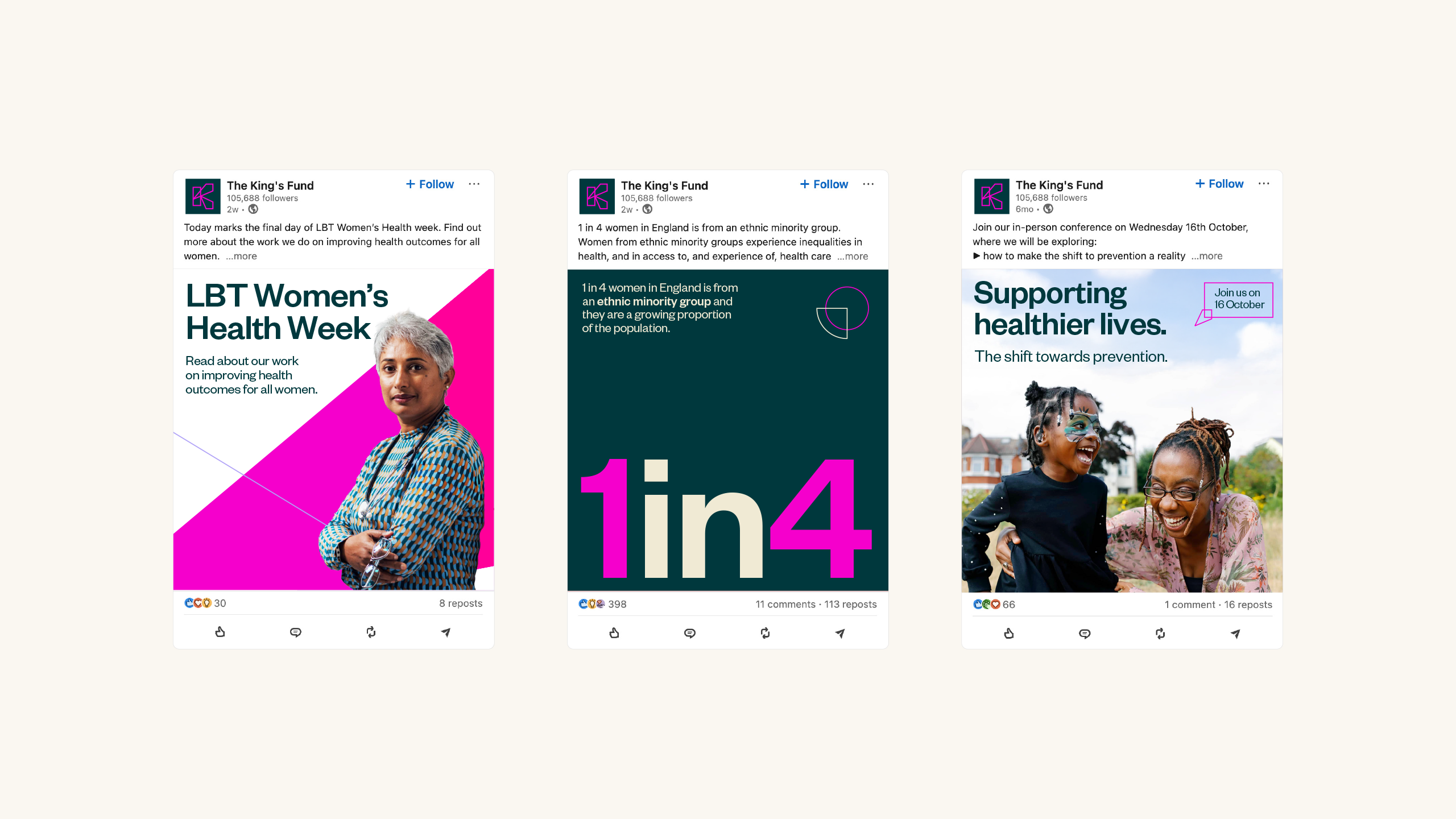
As the nation’s leading think tank for the health and care sector, the new brand identity for The King’s Fund needed to signal a significant shift away from the old guard, as change is desperately needed.
Achieving this required an approach which retained the authority and credibility of the brand and its influence over people in power.

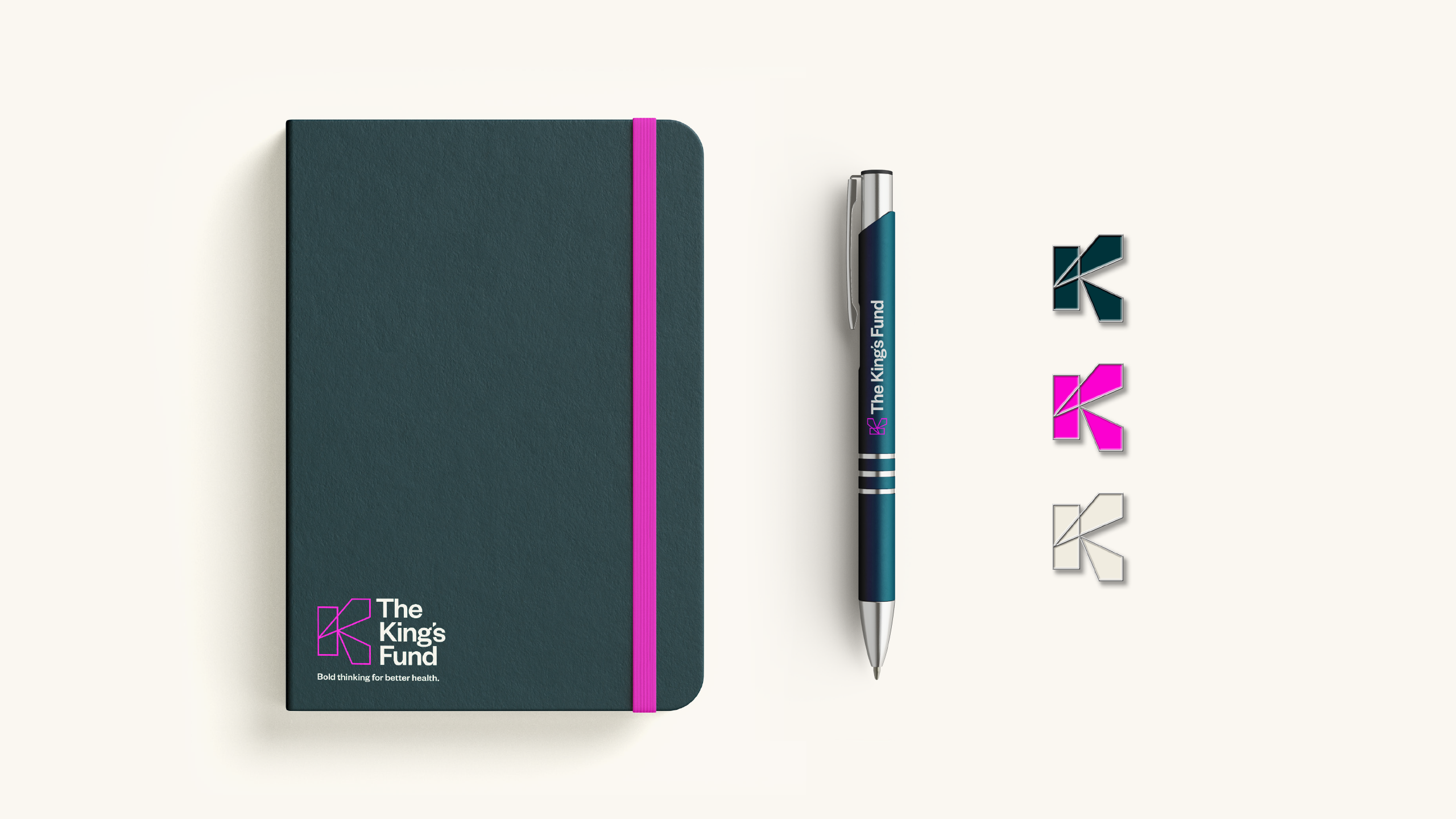
Working with the brand idea of ‘Bold thinking for better health’, developed by Mark Radda, Studio Texture were appointed to refresh the visual identity to mark this significant step change in the organisation and its outward presentation.
The visual identity would be developed with the future in mind, feeling as relevant today as it would in 10 years time. The tone of voice required to be flexible enough to connect with a variety of different audience groups with different needs, from policy makers to junior doctors.
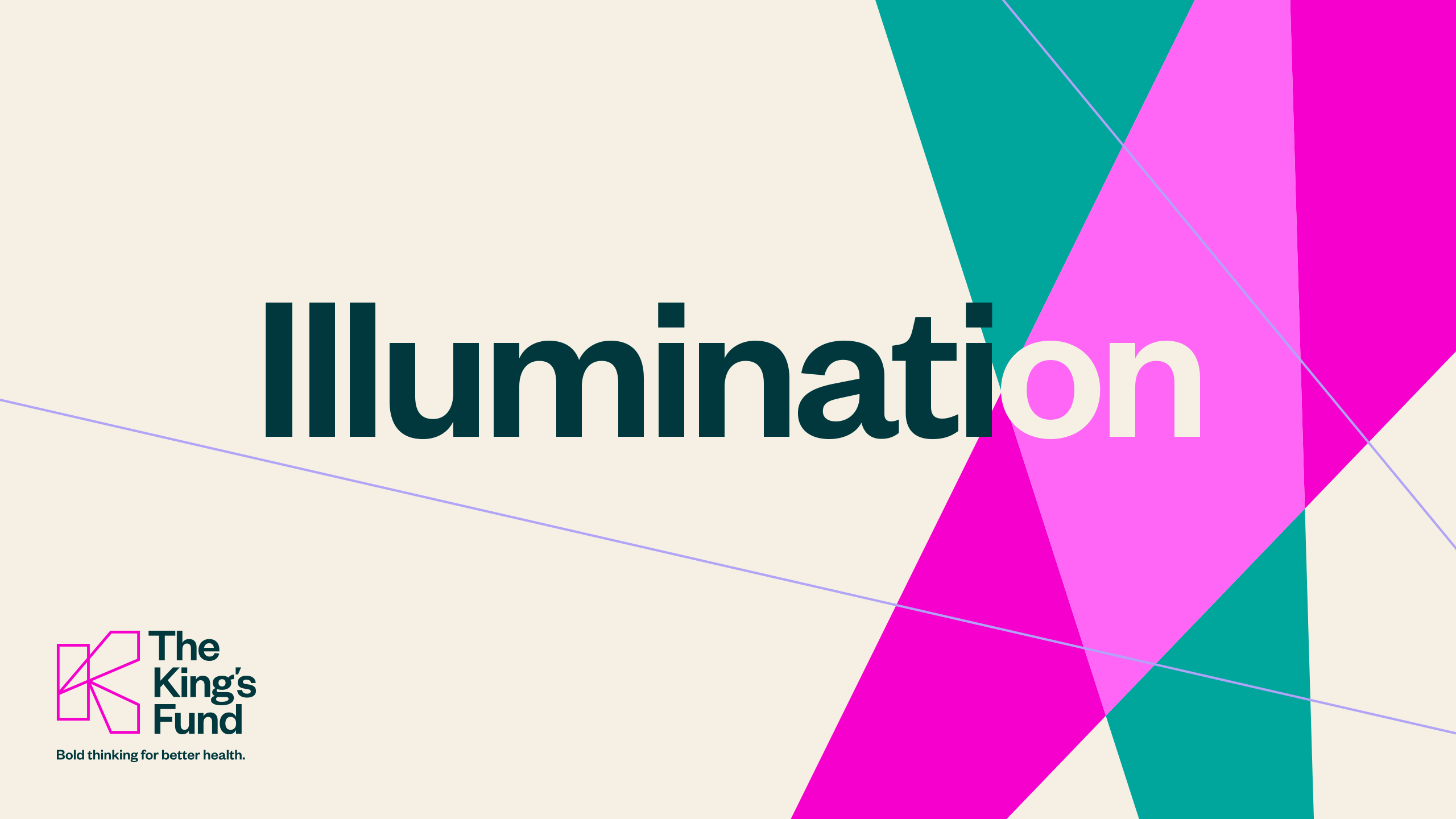
The resulting identity is as bold as it is direct. The logo suggests not just the idea of projecting thinking outwards, but also a framework inviting input. This spirit extends across the brand through the idea of illuminating thought. Typographic plays, witty copywriting and dramatic compositions offer a distinct framework that is a far cry from the ‘old guard’ and positions The King’s Fund as directly facing the future.