Defending childhood
Right to Childhood
Project
Brand strategy + identity
Date
October 2026
When SOS Children’s Villages UK decided to leave its global federation, it faced a critical challenge: create a new name and brand – and do it fast. We were brought in to build a distinctive identity from the ground up, rooted in the charity’s purpose and designed to give it a clear, confident voice.
Research revealed a clear opportunity. While many organisations focused on children’s physical safety and survival, fewer placed love, belonging and emotional security at the heart of their proposition.
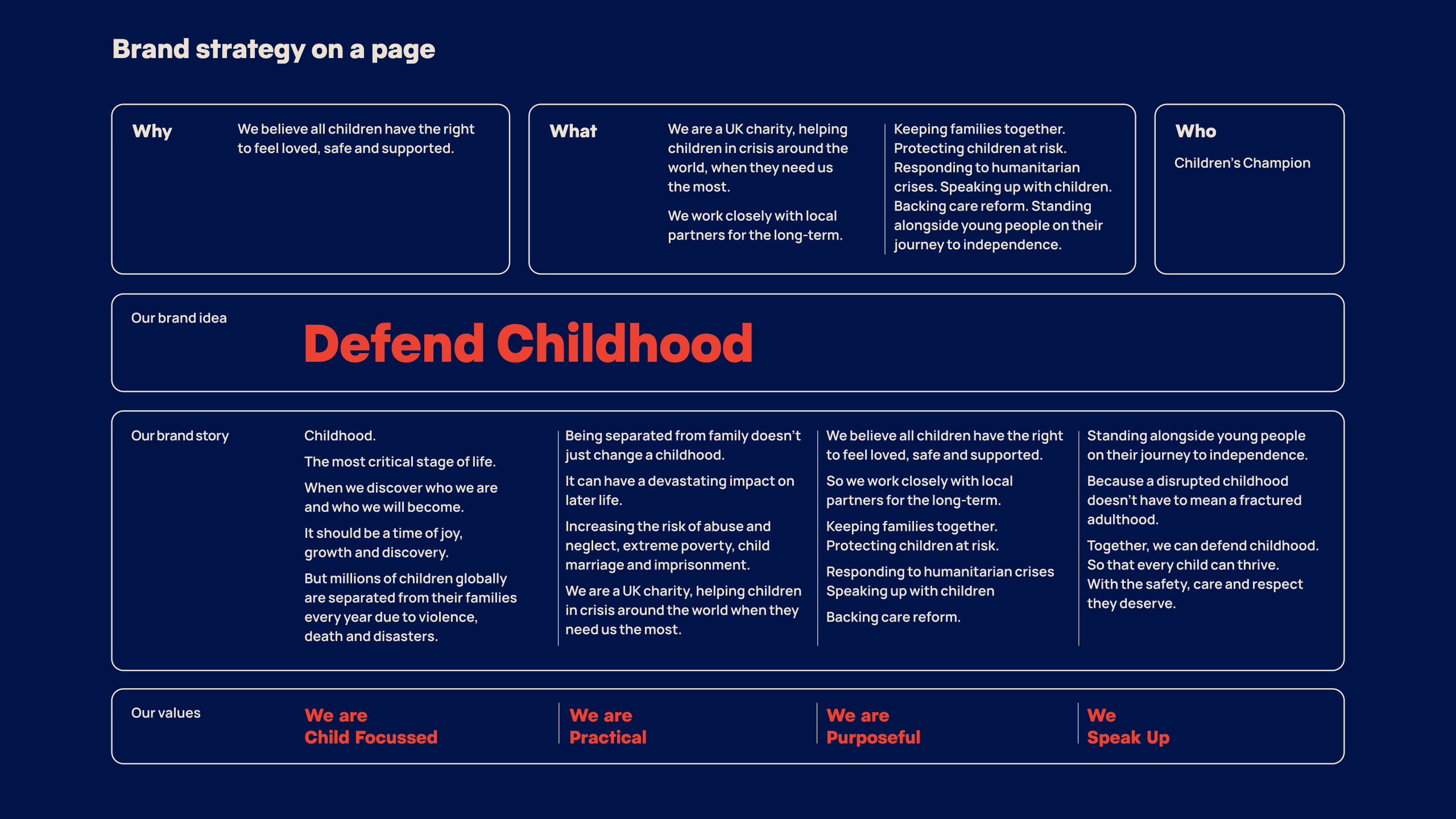
After testing with staff, partners, supporters and potential supporters, we developed the name Right to Childhood, with the strapline Protect Children, Strengthen Families. Together, they capture both what the charity does and what it stands for: a belief that children have the right to feel loved, safe and supported.
The brand personality – Children’s Champion – is expressed through four values: child-focused, purposeful, practical and speak up. At its heart is a simple brand idea: Defend Childhood.


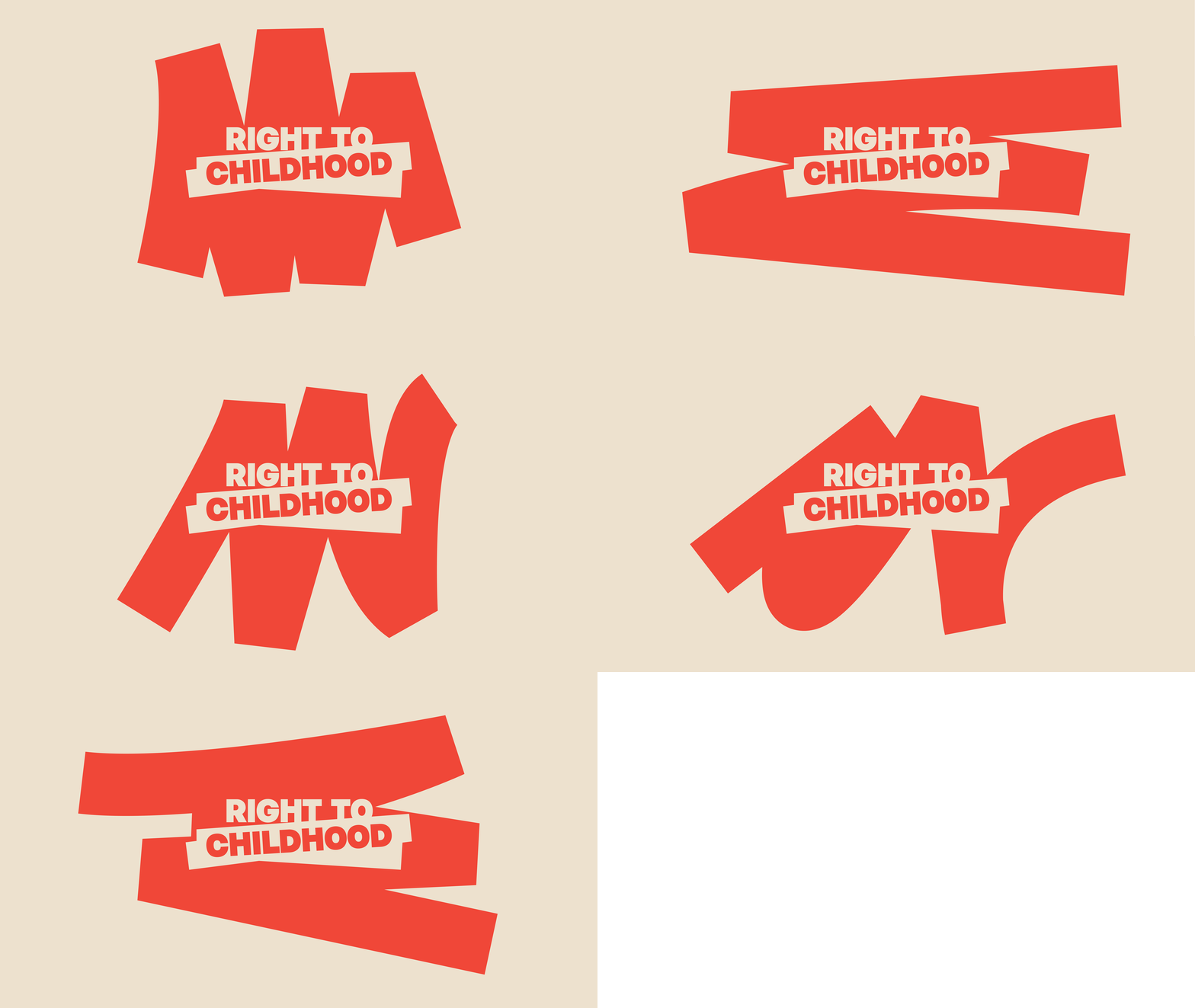
The visual identity centres on bold highlight shapes, reflecting our role in bringing children’s rights into focus, ensuring they are seen and heard. Their bold, gestural character feels immediate and active, echoing the determination to speak up and stand alongside children. No two highlight shapes are identical. Each one is unique, celebrating the individuality of every child and family.
The logo is the most recognisable expression of the brand. It incorporates the signature highlight shape, and reinforces the core idea: drawing attention to what matters most.


Studio Texture were a joy to work with throughout the creation of our new brand. Our brief was complex and presented it’s own challenges, not least the very quick timeframe. But the clear process and excellent project management kept us completely on track. Studio Texture’s willingness to listen, understanding of our needs and abundant creativity, means the result is a powerful new name and brand, which fits us perfectly. Feedback has been overwhelmingly positive and colleagues are all proud and excited to now work for Right to Childhood!
Sarah Bradford
Director of Communications, Brand and Advocacy

We created a colour palette that’s led by a warm red, supported by softer colours, to convey urgency while maintaining a sense of approachability and calm.
The lead typeface, Pacaembu, brings in bold character, allowing the brand to speak with warmth. This is supported by a neutral and functional secondary typeface, Manrope Sans.
Ethical storytelling is at the heart of the photography. Real, authentic moments are captured that reflect the dignity, strength and individuality of the people Right to Childhood work with.
The result? An identity system designed to Defend Childhood.