Multiplying generosity
Big Give
Project
Brand Identity
Date
January 2023
We were approached by match funding charity the Big Give to create a new identity that reflected the significant impact they make in the world.
Working with brand consultant Dan Dufour we rebranded match funding charity the Big Give with a new brand strategy, visual identity and tone of voice.
The Big Give was founded by the businessman and philanthropist Sir Alec Reed in 2007. Since then, it has raised hundreds of millions of pounds for good causes through match funding campaigns, by connecting charities with the public and funders.
But, over time, the brand had lost its appeal and appeared dated and deflated. It no longer reflected the significant impact it sought to make in the world through the thousands of charities it supports.
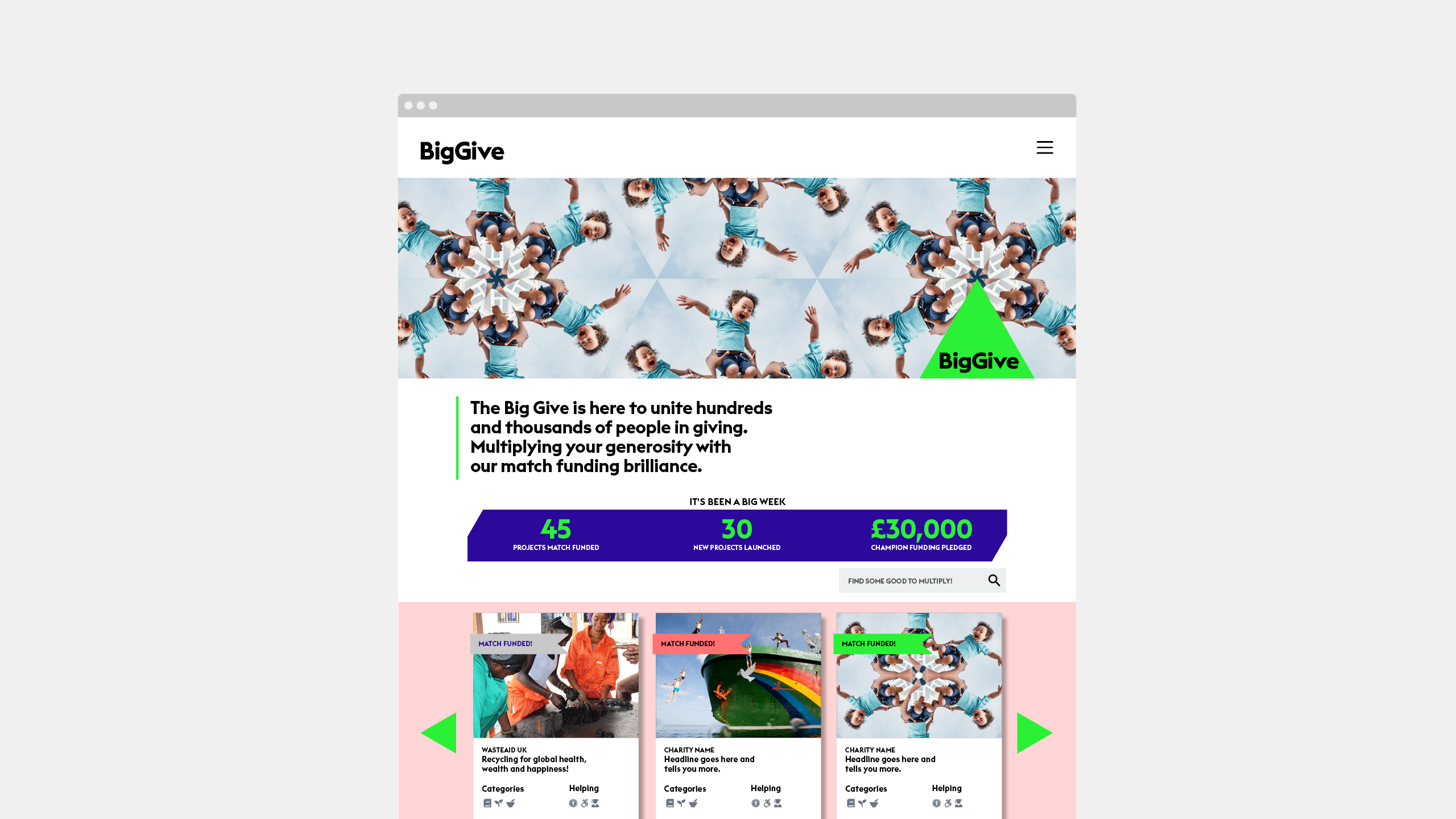
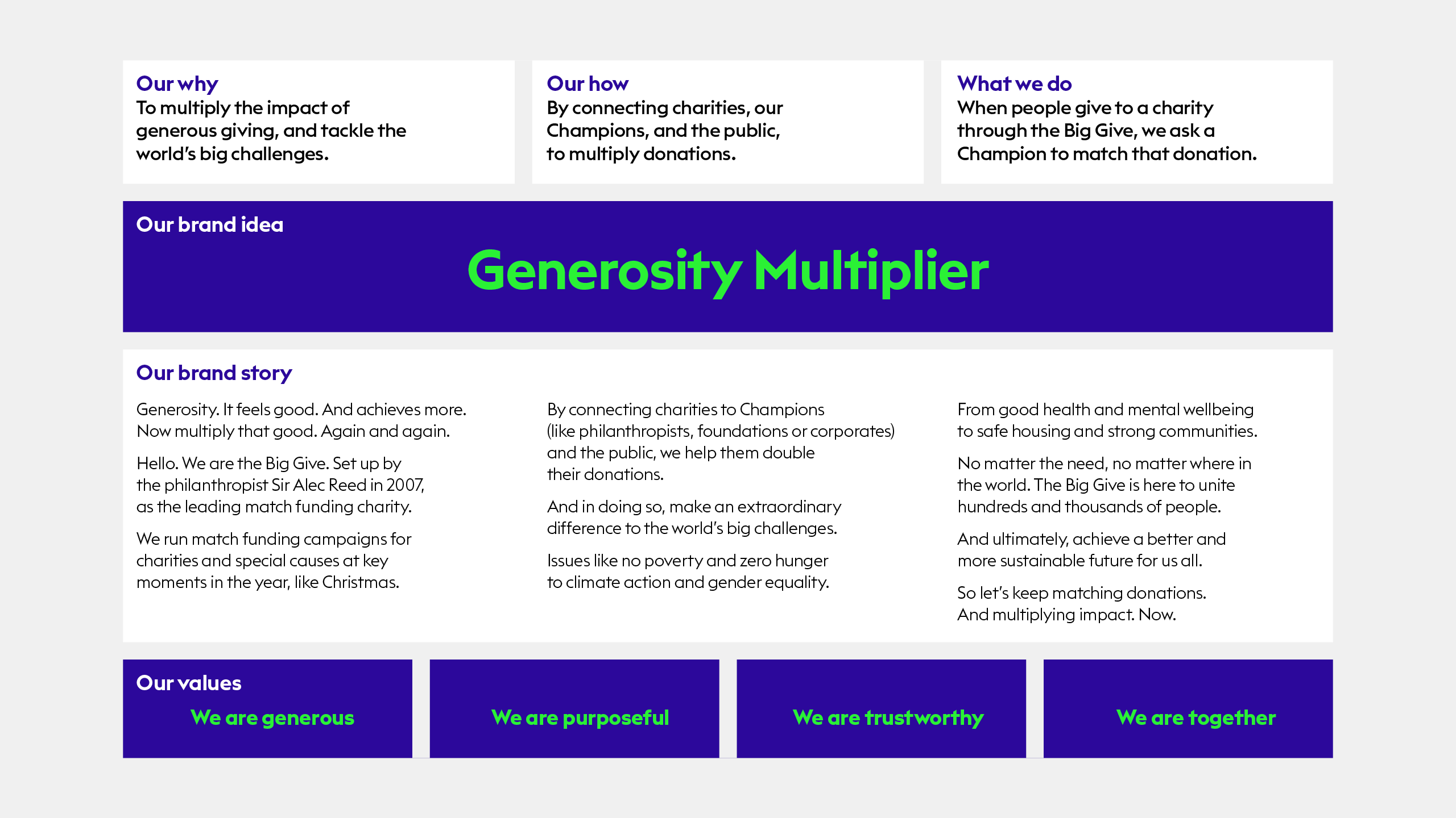
The new brand strategy positions itself around the idea of ‘Generosity Multiplier’. As it is by connecting people, organisations and charities through match funding campaigns, the Big Give can create positive change and an everlasting impact on the world. It quite literally multiplies the impact of our generosity.
This single-minded brand idea of ‘Generosity Multiplier’ immediately inspired multiple visual ideas.
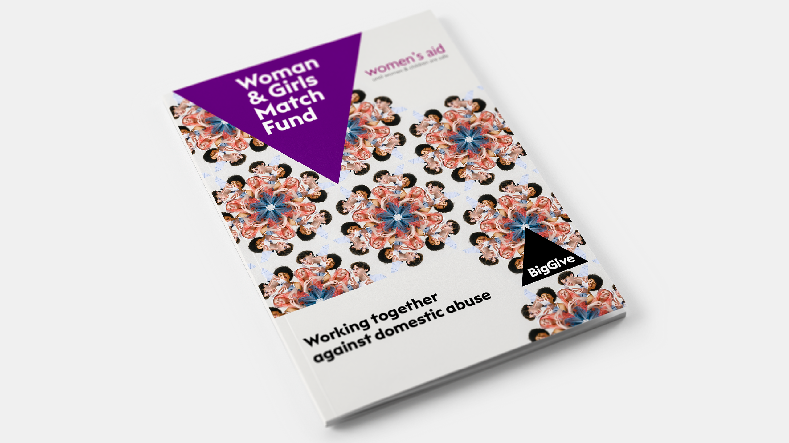
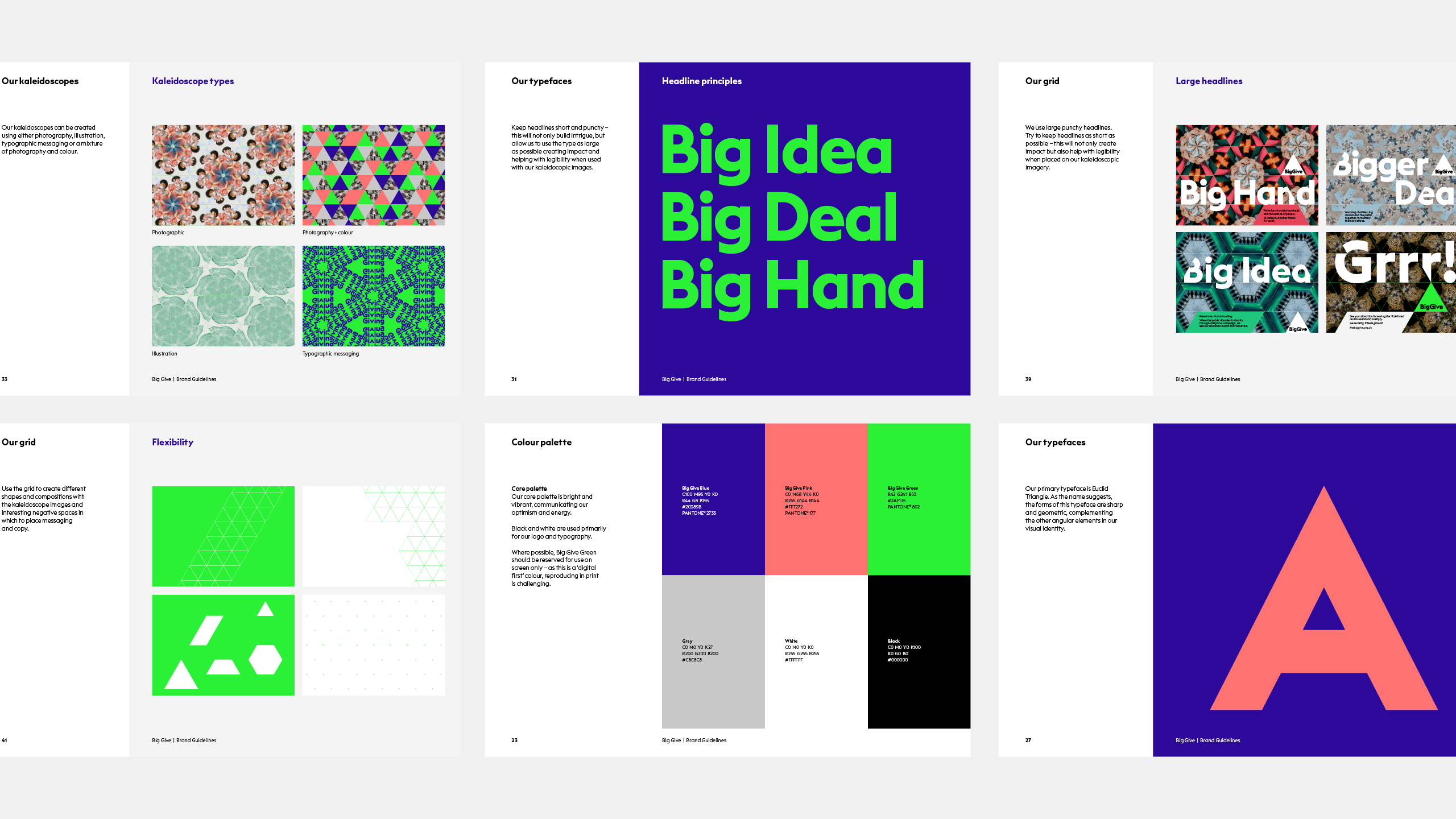
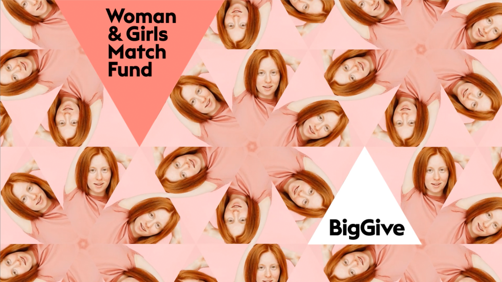
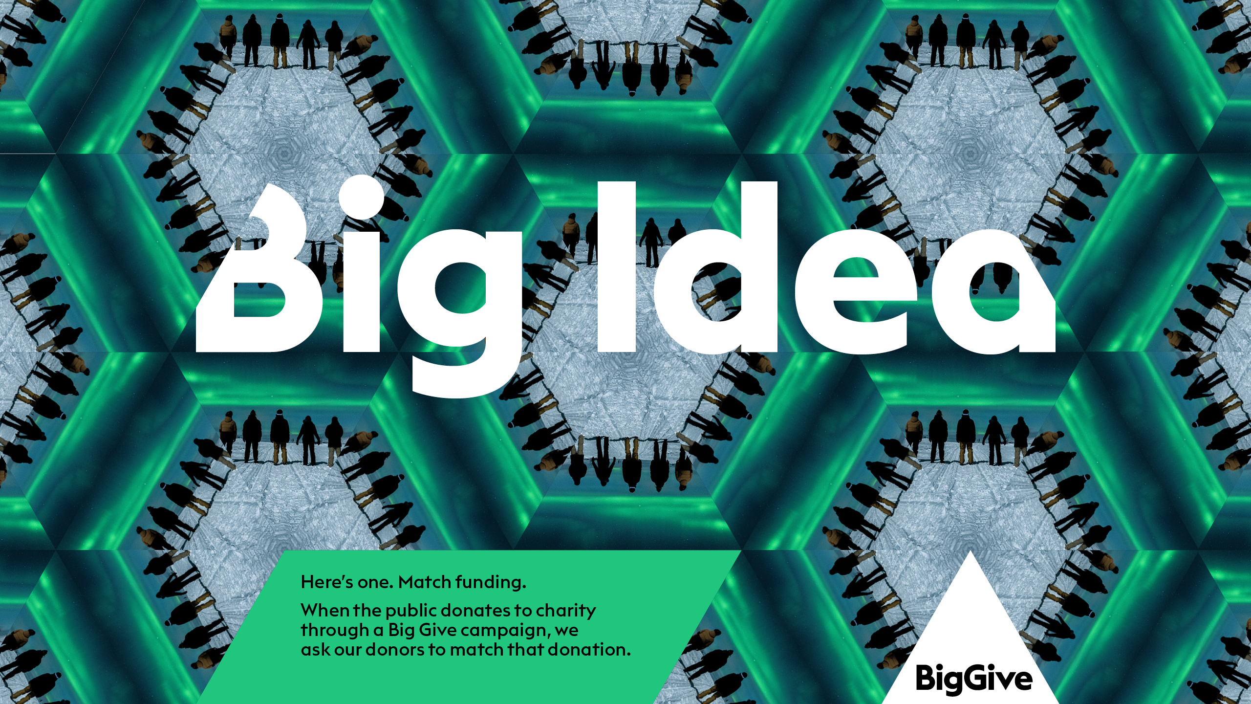
We began experimenting with repetition and duplication. Doubling up and maximising. Then we struck upon the idea of kaleidoscopes. This fitted perfectly. Kaleidoscopes have multiplicity at their heart. They felt exuberant. Mesmerising. And importantly, attention-grabbing and distinctive.
These visuals needed to work both as static images, as well as come to life in motion in surprising ways. We quickly found that all kinds of images worked within them, giving us enormous flexibility, yet consistency. This was key, as the Big Give works with so many different charities that all need to tell a different story.
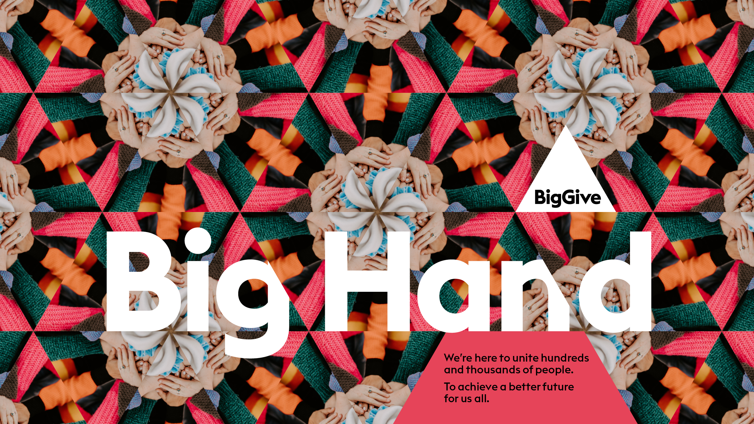
The triangle, as a foundation of the kaleidoscopes, offered us a neat icon which helped communicate the idea of three sides coming together (match funders, charities and the public), to multiply their generosity for good causes. It also offered a grid structure to use across all communications. This underlying structure was referenced in the approach to typography, where headlines are sliced by where they sit on the grid.
The result is a system where every component reinforces a single minded idea.
Studio Texture brought our purpose, vision and brand identity to life. They were able to produce a brand that reflects all the Big Give stands for in a way that’s ownable, memorable and impactful. Creating something that’s effective not just for us but for the match funders and thousands of charities we support.
Alex Day
Managing Director, Big Give